


Description
Overview
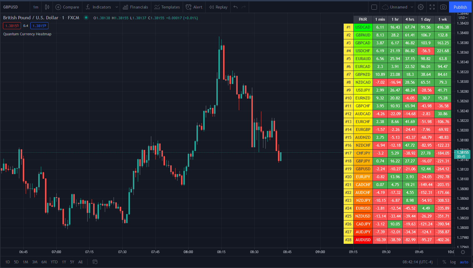
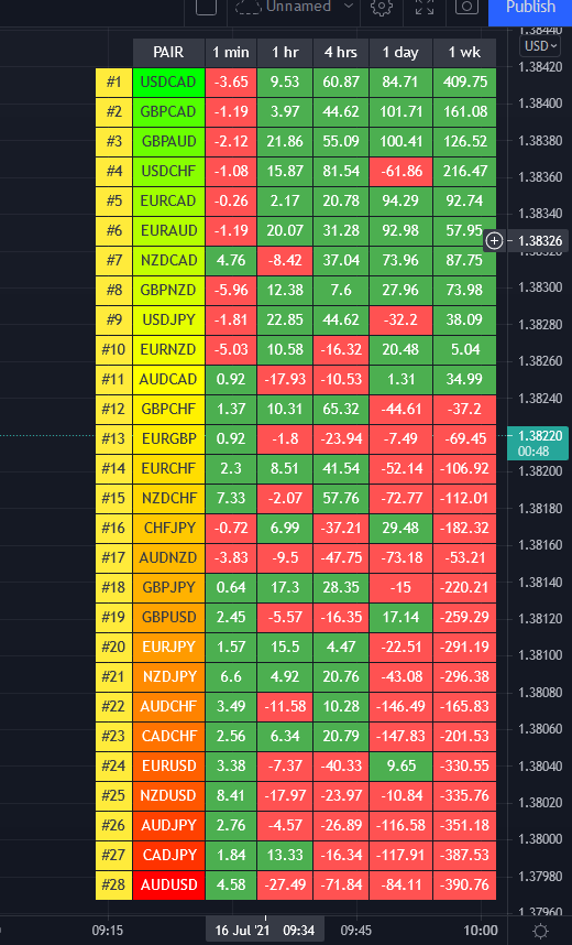
Trading the currency markets is a complex business. With so many pairs and multiple timeframes it is almost impossible to monitor them all – but with the Currency Heatmap you can. The Currency Heatmap indicator delivers the information you need to base your trading decisions on the entire spectrum of currency pairs derived from the 8 major currencies: namely the US dollar, the Euro, the British Pound, the Swiss Franc, the Japanese Yen, the Canadian Dollar, the Australian Dollar and finally the New Zealand Dollar. In one clear and simple table, you can see instantly the entire weight of market sentiment across all 28 pairs and across all timeframes. A global view of risk and sentiment on one chart.
It instantly displays the “hottest” and “coldest” areas of the financial landscape. Vertically, 28 currency pairs are listed and ranked from the most bullish (top) to the most bearish pair (bottom) and reflect the data ranking on the associated currency matrix indicator. And this is where it gets interesting: horizontally, the performance scores of each currency pair are displayed in 5 customizable timeframes.
Interpreting the colors
Each cell of the Currency Heatmap indicator is color coded making it possible to interpret it instantly with just a glance, much like looking at a sophisticated thermal imagery scanner, but for Forex. If you check out the indicator, you will see how easy and intuitive it is, but let us just expand on them here.
If we start with the performance scores. This is the value the indicator assigns to each currency pair representing how positively or negatively its price moved over a certain period. If you have the Currency Matrix indicator, you will also notice that the figures are the same. This is because both use the same algorithm in calculating the performance scores. The cells can be any of the two colors depending on the performance score. This is the color coding used when viewing the currency pairs ACROSS the 5 timeframes or what we like to call the time horizon:
- Green – if the currency pair’s performance score for the aligned timeframe is POSITIVE.
- Red – if the currency pair’s performance score for the aligned timeframe is NEGATIVE.
However, the pairs are then ranked VERTICALLY using a dynamic graded color code transitioning from green, to yellow and to red in that order. The performance scores of the currency pairs in 5 timeframes are added together. The currency pairs are then ranked by their sum from the most positive to the most negative and are color coded as follows:
- Green shades – the sum of the currency pair’s performance scores in 5 timeframes is well above the fulcrum of zero.
- Yellow shades – the sum of the currency pair’s performance scores in 5 timeframes is relatively flat and around the fulcrum of 0. It can either be positive or negative but trails the numbers closest to 0.
- Red shades – the sum of the currency pair’s performance scores in 5 timeframes is well below the fulcrum of zero.
The gradation of color is dynamic and hence the transition of colors will depend entirely on the sum of the currency pair’s performance scores in 5 timeframes as explained above. As with all our other indicators, this is dynamic and is constantly shifting in real time to reflect the ebb and flow of sentiment across the timeframes.
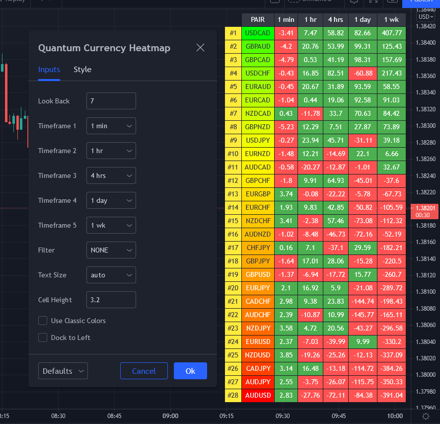
Customizable timeframes
The Currency Heatmap for TradingView allows you to change the timeframe of each of its 5 columns. This can be configured in the indicator settings where you can select 1 of many timeframe options namely:
- 1 min
- 2 min
- 3 min
- 4 min
- 5 min
- 10 min
- 15 min
- 30 min
- 45 min
- 1 hr
- 2 hrs
- 3 hrs
- 4 hrs
- 1 day
- 2 days
- 3 days
- 1 wk
- 1 mo
The 5 default timeframes (from left to right) are listed below:
- Timeframe 1: 1 min
- Timeframe 2: 1 hr
- Timeframe 3: 4 hrs
- Timeframe 4: 1 day
- Timeframe 5: 1 wk
The ranking of the 28 currency pairs changes depending on the timeframes you select for each column. This flexibility allows you to monitor the strength of the pairs within your own range of timeframes in real time.
Weight of the timeframes
One important factor to consider when interpreting the Currency Heatmap indicator and the ranking aspect, is the fact that the performance scores in each timeframe inherently possess weight, and this is reflected in how the indicator has been developed. As you can appreciate, the weight of sentiment in a slower timeframe is greater than that in a faster timeframe. Simply put, the weight of each timeframe is directly proportional to the timeframe itself. Faster timeframes carry less weighting to the overall ranking, whilst slower timeframes carry more. This means currency pairs ranking near or at the bottom of the ladder (bearish) are most likely to have red cells through the slower timeframes or the columns at the right-hand side of the indicator. Similarly, the currency pairs at the top and ranking as bullish or very bullish, again are most likely to have green cells through the slower timeframes.
Stepping back, the changing colors deliver a heatmap reflecting the relative performance of the 28 currency pairs across ALL timeframes in real time. This gives a horizontal analysis of the currency pairs across time. Immensely powerful. And empowering you as a trader to make clear, logical, and fast decisions.
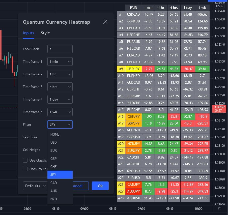
Currency filter
The Currency Heatmap allows you to filter the currency pairs relevant to the currency you are analyzing. An input is provided in the indicator’s settings window which you can click to select a currency.
- USD selects all currency pairs that contain the US Dollar.
- EUR selects all currency pairs that contain the Euro.
- GBP selects all currency pairs that contain the British Pound.
- CHF selects all currency pairs that contain the Swiss Franc.
- JPY selects all currency pairs that contain the Japanese Yen.
- CAD selects all currency pairs that contain the Canadian Dollar.
- AUD selects all currency pairs that contain the Australian Dollar.
- NZD selects all currency pairs that contain the New Zealand Dollar.
Click the Filter option box and select a currency in the list to apply a filter. If you like to undo a filter, simply select NONE. When a certain currency filter is in effect, the currency pairs that include the selected currency in the heatmap appear in color.
Getting started
Here are some further details on the Currency Heatmap indicator to help you get started:
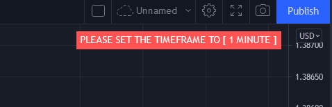
- Your Quantum Currency Heatmap indicator must always be applied in a 1 min chart.
- The indicator occupies its own indicator window in the chart. We recommend expanding the indicator vertically to get a complete view.
- When you first apply the indicator, please allow a few seconds for the data to build in history.
Currency Dashboard
By itself, the Quantum Currency Heatmap indicator is a powerful trading tool for identifying trading opportunities, quickly, easily on a single chart. However, its development is part of a new indicator bundle that we like to call the Quantum Currency Dashboard which consists of the following indicators:
- Quantum Currency Strength Indicator (CSI)
- Quantum Currency Matrix
- Quantum Currency Array
- Quantum Currency Heatmap
These four indicators then provide a unique and compact insight into all the various aspects of strength and weakness for both currencies and currency pairs from trend and momentum to overbought and oversold. What is unique is that using four charts you are then able to monitor the myriad combinations of strength, weakness, momentum, congestion and divergence across the entire forex complex at a click of a button. And even more powerfully giving you the confidence to get in and stay in for maximum profits. No more missed opportunities, no more struggling with multiple charts, and no more trader regret whatever your trading style approach.